When writing blog posts I like to use “tip” sections to call out key points. Here’s a screenshot:
At first I created these by hand with custom HTML and CSS but after doing it a couple of times I decided to make a reusable component that I could more easily add to the site.
I added the file _includes/tip.html to my Jekyll installation with the following contents:
<div class="tip" style="
background-color: {{ include.background_color | default: '#ECF7FF' }};
border-left: 6px solid {{ include.border_color | default: '#0065B4' }};
padding: 1em 1em 1em 1em;
display: flex;
column-gap: 2rem;
margin: 2em 2em 2em 2em;">
<p class="tip-bulb" style="
font-family: 'Font Awesome 5 Free';
vertical-align: middle;
font-weight: 900;
font-size: {{ include.bulb_size | default: '3em' }};
color: {{ include.bulb_color | default: '#ff6f00' }};">{{ include.icon | default: '' }}</p>
<p class="tip-content">{{ include.content }}</p>
</div>
This defines a div to hold the entire tip (the class tip is unused, but maybe it will be useful for someone). Then there is a paragraph that contains the tip character - in this case a Font Awesome lightbulb with some styling. This is followed by the tip contents. Also notice that some of the colors and sizes are configurable with reasonable defaults.
To use this I now can add tips like:
{% include tip.html content="Early boarding is very busy and you will be crammed into a room with a lot of other people. If you have crowd anxiety, you may want to select a later boarding time." %}
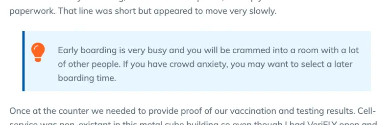
This renders like:
Early boarding is very busy and you will be crammed into a room with a lot of other people. If you have crowd anxiety, you may want to select a later boarding time.
But let’s say I wanted to change it up a little. I want to change the icon to a big down stonk and I want the colors to be red to really highlight how far down the stonks are.
I’ll use the customizations like this:
{%
  include tip.html
  content="Things aren't looking great!"
  icon=''
  bulb_size='5em'
  background_color='#FFEDED'
  border_color='#D60000'
  bulb_color='#FF0000'
%}
Things aren't looking great!
If you want to use this reusable component you can download the latest version of tip.html and get started!